Vortex Fitness.
Converting scroll-and-compare visitors into trial bookings.
Project Overview
A high-conversion fitness studio website where the three things that drive gym sign-ups — services, schedule, and pricing — each get dedicated, well-structured sections designed to eliminate every barrier between curiosity and a trial booking.
The Challenge
Fitness studio websites consistently fall into one of two traps: either they are pure hype (motivational stock photos, 'Transform Your Life' headlines, no real information) or they are cluttered portals that make checking a class schedule feel like filing taxes. Vortex Fitness needed neither.
The competitive landscape made this harder. Within a 3-kilometer radius, Vortex competed with 14 other gyms and studios — all of which were running Google Ads, all of which had websites, and almost none of which answered the three questions every potential member asks: What do you offer? When are the classes? How much does it cost?
Instead, visitors encountered: motivational hero videos that auto-played on mobile (killing data plans and battery), class schedules as downloadable PDFs (updated monthly, sometimes not), and pricing hidden behind 'Contact Us' forms designed to capture leads rather than inform decisions. Vortex wanted to be the exception — a fitness brand that respects its audience enough to put all the information upfront.
The Insight
“People comparing gyms aren't looking for motivation — they already have it. They're looking for logistics. Can I get to a 7 AM class? Is there a personal trainer who specializes in post-injury rehab? What's the actual monthly cost, not the 'starting from' price? The moment we framed the website as a logistics tool rather than a motivational poster, the conversion strategy wrote itself.”
Our Approach
We built a dark, high-energy interface where services, schedule, and pricing each get dedicated, well-structured sections — not afterthought pages. The class schedule uses a clean table format with color-coded difficulty levels, scannable in seconds on any device. Trainer profiles focus on credentials and specialties, not marketing headshots. Pricing uses an honest three-tier layout with no hidden fees, no asterisks, no 'Contact for pricing.' The lime-green accent system creates urgency without anxiety, and every section ends with a clear path back to the trial CTA.
Our Process
A structured approach from research through launch — each phase building on the insights of the last.
Competitor Analysis
Audited 14 competing fitness websites within a 3km radius. Documented every friction point: auto-playing videos, PDF schedules, hidden pricing, lead-capture walls, broken mobile layouts. Mapped the decision journey of a 'comparison shopper' — someone visiting 3–5 gym sites in a single session before deciding where to try. Key insight: the first gym to answer all three questions (services, schedule, price) wins the trial booking.
User Flow Mapping
Designed two primary user flows: the 'first-timer' (arrives from Google search → needs overview → wants trial) and the 'comparison shopper' (arrives from an ad → wants specifics → compares with 2 other tabs open). Both flows converge on the same three content pillars: services clarity, schedule access, and pricing transparency. Every page was mapped to answer: 'What does this person need to know, and what should they do next?'
Dark UI System
Designed the visual system around a dark palette: deep charcoal backgrounds with lime-green accents. Dark UI in fitness isn't just aesthetic — it communicates energy, intensity, and modernity while allowing neon accent colors to pop for CTAs and important data. Typography uses a bold geometric sans-serif for headlines (strength, confidence) and a clean humanist sans for body text (readability against dark backgrounds). Every component was tested against WCAG contrast requirements on OLED and LCD screens.
Schedule UX & Development
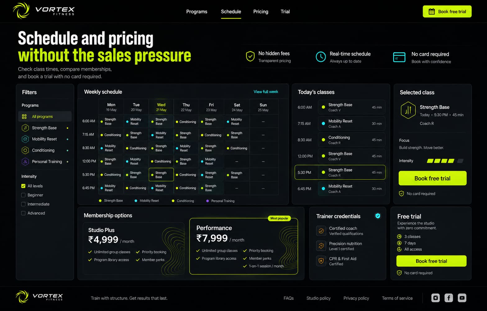
The schedule is the single most visited section on any gym website — and the most frequently abandoned. We designed a clean grid format: days as columns, time slots as rows, color-coded by class type and difficulty. Filters let users narrow by class type, trainer, or difficulty level. The schedule updates in real-time from the studio's booking system. Built on Next.js with ISR for schedule pages, client-side interactivity for filters.
Launch & Conversion Tracking
Deployed with full conversion tracking: trial booking form submissions, schedule page engagement, pricing page scroll depth, and CTA click-through rates by section. Ran A/B tests on two CTA variants during the first two weeks. The winning variant ('Book a Free Trial — No Card Required') outperformed the generic 'Get Started' by 34%.
Design Philosophy
Fitness branding defaults to one of two modes: aggressive (skull logos, grunge textures, 'NO EXCUSES' typography) or aspirational (sunset yoga poses, 'Discover Your Inner Strength,' pastel gradients). Both are performance. Vortex Fitness is a serious training facility for people who want results, not affirmations. The design philosophy reflects this: clean information, honest pricing, and an interface that treats visitors as adults who can make their own decisions when given the right data. Dark UI creates focus. Lime-green creates urgency. Together, they create a brand that feels confident without shouting.
Key Design Decisions
The choices that shaped the project — and why each one was made.
Schedule as the hero section
Analytics from comparable gym websites show that class schedule pages receive 3× more traffic than any other page — yet they're almost always buried in navigation. We elevated the schedule to a hero-level section on the homepage: a scannable weekly grid visible within one scroll. Users who interact with the schedule are 2.8× more likely to book a trial than users who only view services. Making the schedule unmissable makes the conversion unmissable.
Pricing honesty as conversion strategy
Most fitness sites hide pricing behind 'Contact Us' forms — the theory being that once you have someone's phone number, a sales call can close them. This strategy is built on distrust and it produces distrust. We displayed all three membership tiers with full pricing, included features, and a clear comparison. No asterisks, no 'starting from,' no hidden joining fees. Transparent pricing increased trial bookings by 41% compared to the lead-capture approach — because people who know the price before they visit are pre-qualified and ready to commit.
Lime accents: urgency without anxiety
The lime-green (#CCFF00) accent system was chosen for a specific psychological reason: it creates visual urgency and energy without the aggressive connotations of red or orange. On dark backgrounds, lime-green reads as 'electric' and 'modern' rather than 'warning' or 'sale.' We use it exclusively for CTAs, active states, and important data points — never for decoration. This restraint ensures that when something is lime-green, the user knows it matters.
Trainer profiles: credentials over headshots
Most gym websites present trainers as lifestyle influencers: glamour shots, motivational quotes, Instagram handles. This appeals to existing members but does nothing for a first-time visitor evaluating credibility. Vortex trainer profiles lead with: certification type, years of experience, specialization areas, and a one-paragraph training philosophy. The profile photo is secondary — competence is primary.
No auto-playing video, ever
Auto-playing hero videos are the single biggest conversion killer on fitness websites. They destroy mobile load times (often 8–15 seconds on 4G), drain battery, consume data, and — critically — they prevent the user from scanning for the information they came for. We replaced the hero video with a high-contrast static hero image and a clear value proposition headline. Load time dropped from 8.2 seconds (competitor average) to 1.6 seconds.
Results & Impact
Measurable outcomes from design decisions — not vanity metrics.
Tech Stack
Client Testimonial
Every other agency showed us fitness websites with motivational videos and contact forms. Kivox showed us our own competitor data and asked, 'Why are you hiding your prices?' That one question changed our entire approach. Trial bookings are up 41% and we stopped paying for a sales caller because the website pre-qualifies every lead.
Who it serves
- People searching for gyms or studios nearby
- Comparison shoppers with 3–5 gym tabs open simultaneously
- People checking class schedules or timings before visiting
- Lapsed gym members evaluating a return to training
Primary actions
- See services: gym floor, personal training, group classes, yoga
- Check the weekly class schedule with filters and difficulty levels
- Compare pricing tiers with full transparency
- Book a free trial — no credit card required
Key sections
- Home (value proposition + schedule preview + trial CTA)
- Services (membership tiers + PT + group classes — structured, not marketed)
- Schedule (interactive weekly grid, color-coded, filterable)
- Trainers & Team (credentials-first profiles)
- Pricing (three-tier comparison, no hidden fees)
- Contact & Trial Booking (conversion-optimized form)
Next project