Greenfield Academy.
Building trust architecture for parents navigating admissions season.
Project Overview
An admissions-first school website that inverts the typical educational institution hierarchy — leading with clarity, data, and a structured inquiry path instead of burying the process parents actually need behind layers of institutional marketing.
The Challenge
School websites face a challenge no other industry shares: the decision-maker (parent) is evaluating trust, competence, and values simultaneously — often under time pressure during admissions season. And they're making this evaluation for someone else: their child. The stakes feel enormous, and the information available is almost always inadequate.
Greenfield Academy's existing site was a textbook case of institutional self-presentation over parent utility. The homepage led with a drone shot of the campus, a mission statement written by committee, and a rotating carousel of achievement banners. The admissions process — the one thing 80% of visitors came for — was buried three clicks deep, behind 'About Us,' 'Our Legacy,' and 'Leadership.'
Parents reported spending 15–20 minutes on the site and still not knowing: What grades do you offer? What are the fees? How do I apply? When is the deadline? These are not complex questions. They were just impossible to answer from the website.
The Insight
“Parents visiting a school website aren't browsing — they're evaluating. They arrive with a mental checklist: programs, fees, admission steps, and a gut feeling about whether this institution will take care of their child. The website's job isn't to impress them — it's to answer every question before they need to call.”
Our Approach
We inverted the hierarchy. The admissions timeline is treated as the primary journey: a clear, three-step process visible from the homepage. Program descriptions are structured by age group with specific outcomes, not buzzwords. The fact strip — student count, teacher ratio, board results — loads above the fold because parents want data, not slogans. Typography uses a traditional serif for headlines (signaling stability and institutional gravity) paired with a modern sans-serif body for readability. The green palette communicates growth without being childish.
Our Process
A structured approach from research through launch — each phase building on the insights of the last.
Parent Research
Interviewed 25 parents across three categories: prospective (evaluating schools), current (enrolled, familiar with the institution), and churned (chose a competitor). Mapped the decision journey from initial awareness to enrollment completion. Key finding: parents visit an average of 6 school websites before shortlisting 2 — and the #1 differentiator isn't reputation, it's information clarity.
Content Audit & IA Restructure
Audited every page on the existing site. Found 40+ pages of content, of which only 12 answered questions parents actually asked. Restructured the information architecture around four parent questions: (1) Is this school right for my child's age? (2) What will they learn? (3) How do I apply? (4) What does it cost? Everything else became secondary.
Visual Design
Designed a visual system that balances institutional credibility with warmth. The serif-sans pairing communicates tradition and modernity simultaneously. The color system uses forest green (growth, trust) with warm sandstone (approachability) and crisp white (clarity). Photography guidelines prioritize candid learning moments over posed group shots — because parents want to see what a Tuesday morning looks like, not a graduation ceremony.
Development & CMS
Built on Next.js with a structured CMS that allows the admissions team to update deadlines, fee structures, and program details without developer involvement. Forms use progressive validation with clear, non-technical error messages — because a parent filling out an inquiry form at 11 PM shouldn't have to decode 'Invalid format in field 3.'
Launch & Training
Deployed with a half-day training session for the admissions and communications team. Created a content playbook covering: how to write program descriptions (outcomes, not buzzwords), how to photograph campus life (candid, not posed), and how to update admissions timelines seasonally.
Design Philosophy
Educational institution websites default to one of two extremes: either corporate-sterile (glass buildings, stock handshakes, 'excellence' repeated forty times) or infantilized (primary colors, cartoon mascots, clip-art borders). Neither serves the parent, who is an adult making an adult decision. Our design philosophy treated parents as intelligent evaluators who deserve clear information, honest representation, and a website that respects their time. The design should feel like a well-organized prospectus, not a marketing brochure.
Key Design Decisions
The choices that shaped the project — and why each one was made.
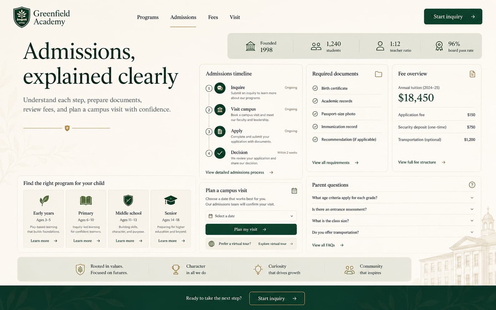
Admissions as the primary journey, not a footer link
On the previous site, the admissions page received 4× more traffic than the homepage — but was accessed via a dropdown menu three levels deep. We moved the admissions timeline to the homepage, below the hero. The three-step process (Inquire → Visit → Apply) is visible without scrolling on desktop. Our post-launch data showed a 52% increase in inquiry form starts within the first month.
The data strip: facts above the fold
Parents want institutional proof before emotional persuasion. The fact strip — founded year, student count, teacher-student ratio, board pass rate — loads immediately below the hero. These four numbers answer the 'Is this school legitimate?' question in 2 seconds. We tested this against a version where the data strip appeared mid-page; the above-the-fold version produced 28% more scroll depth (parents who got their legitimacy check continued reading).
Program pages structured by age, not department
The previous site organized programs by academic department (Mathematics, Sciences, Languages). This makes sense to educators but not to parents. A parent of a 6-year-old doesn't search for 'Mathematics' — they search for 'what will my child do in Class 1?' We restructured program pages by age group (Early Years, Primary, Middle, Senior), each with specific learning outcomes, daily schedule structure, and progression paths.
Serif headlines as institutional gravity
Typography in educational design carries implicit messaging. Sans-serif-only sites read as 'modern but unestablished.' Full-serif sites read as 'traditional but outdated.' We paired a serif display face for headlines (communicating stability, history, seriousness) with a clean sans-serif for body text (communicating clarity and approachability). The combination signals: 'We've been here long enough to know what we're doing, and we're clear-headed enough to explain it.'
Photography: Tuesdays, not graduation day
Every school website features the same photographs: smiling children in perfect uniforms, trophy ceremonies, annual day performances. These images don't help parents evaluate daily life. Our photography guidelines prioritized 'Tuesday morning' moments: a child focused on a workbook, a small-group science experiment, a teacher kneeling to explain something. Candid over posed, always.
Results & Impact
Measurable outcomes from design decisions — not vanity metrics.
Tech Stack
Client Testimonial
We used to get 30 calls a day during admissions season — most of them asking questions that should have been on the website. After the redesign, calls dropped to single digits and inquiry form submissions tripled. Parents tell us the website gave them confidence before they ever visited campus.
Who it serves
- Parents evaluating the school for the first time
- Parents looking for specific admissions steps and deadlines
- Families checking fee structure, programs, and grade-level details
- Returning parents comparing Greenfield against shortlisted competitors
Primary actions
- Understand programs by age group and fit for their child
- Follow the admissions timeline (Inquire → Visit → Apply)
- Submit an inquiry form or schedule a campus visit
- Review fee structure and required documentation
Key sections
- Home (positioning + fact strip + admissions CTA + programs preview)
- Programs & Curriculum (organized by age group, not department)
- Admissions (steps, timeline, required documents, fee structure, FAQs)
- Campus Life (candid photography, facilities, extracurriculars)
- Contact & Inquiry (mobile-optimized form with clear validation)
Next project