The Roastery.
Turning a neighborhood cafe's digital presence into a visit-driving machine.
Project Overview
A visit-intent website for an independent specialty cafe — where every pixel is optimized for the only question that matters: 'Should I go here right now?'
The Challenge
The Roastery had everything a great cafe needs: exceptional single-origin beans, a meticulous roasting process, and a loyal neighborhood following. What it didn't have was a digital presence that matched the craft.
Their existing website was what most independent cafes settle for: a WordPress theme with a hero image, an Instagram feed widget, a Google Maps embed, and a PDF menu that required downloading, zooming, and squinting on mobile. It was a placeholder, not a destination.
But the real problem ran deeper than aesthetics. People visiting a cafe's website are making a real-time decision — not researching a future purchase. They're standing on a street corner, or sitting in a car, asking one question: 'Should I go here, right now?' That means the answer needs to load in under two seconds, on a spotty 4G connection, on a screen they're reading in direct sunlight. The menu needs to be scannable without pinch-zooming. Hours need to be visible without scrolling. Location needs to be one tap away from turn-by-turn directions.
The Insight
“A cafe website isn't a brochure — it's a real-time decision tool. The visitor has already decided they want coffee. They're choosing where. Every element on the page either accelerates that decision or gets in the way.”
Our Approach
We designed a mobile-first, performance-obsessed experience where hours, location, and the full menu are accessible without a single scroll on mobile. The design language mirrors the craft itself: warm serif headlines over clean sans-serif body text, espresso-toned color tokens, and a layout rhythm that feels like a well-designed printed menu — not a tech startup landing page. Photography was shot on-site over two mornings to capture genuine light and texture. The features section avoids marketing superlatives entirely. Instead, it states simple facts: 'We roast in small batches every Tuesday.' Proof over promises, always.
Our Process
A structured approach from research through launch — each phase building on the insights of the last.
Brand Discovery
Spent two full days at The Roastery: morning rush, afternoon lull, evening close. Documented the physical experience — how baristas present menus, how regulars order, how first-timers navigate. Mapped the gap between the in-store experience (warm, confident, knowledgeable) and the digital experience (generic, slow, forgettable).
Menu Architecture
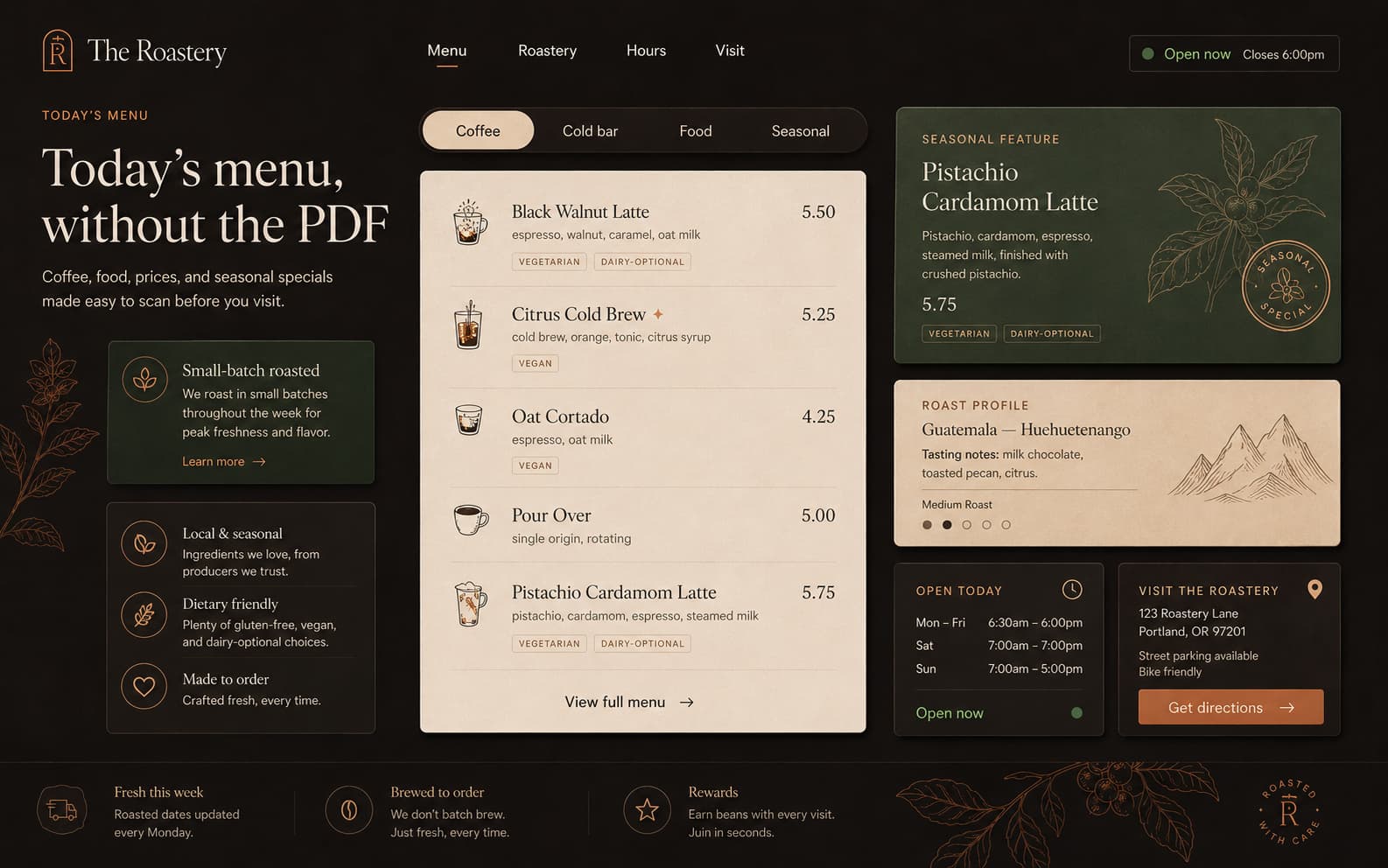
Restructured the menu from a flat PDF into a scannable, categorized system: Coffee (by method), Food (by time of day), Seasonal Specials (rotating). Each item shows price, dietary tags, and a one-line description — nothing more. Tested readability at arm's length on an iPhone SE screen in simulated outdoor sunlight.
Visual Design
Built the visual system around the cafe's natural palette: dark roast browns, oat milk creams, and a single copper accent for CTAs. Typography pairs a serif display face for warmth with a modern sans-serif for clarity. Layout uses a single-column structure on mobile with generous padding — no hamburger menus, no nested navigation.
Performance Engineering
Built on Next.js with static generation. Every image runs through automated WebP compression with LQIP placeholders. Fonts are subsetted to the exact glyphs used. The entire page — including all images — loads in under 1.4 seconds on a throttled 3G connection. Performance isn't a technical metric — it's a hospitality metric. Fast loading is the digital equivalent of not making a guest wait at the door.
Launch & Handoff
Deployed with a lightweight CMS integration allowing The Roastery to update menu items, seasonal specials, and hours without touching code. Documented the content editing workflow with annotated screenshots for the staff.
Design Philosophy
The Roastery's physical space communicates through restraint: no neon signs, no menu boards with 47 options, no loyalty app QR codes on every table. The website needed to match that discipline. We designed for subtraction — removing every element that didn't directly serve the visitor's real-time decision. The result is a site that feels less like a 'website' and more like a well-designed menu card you'd find at the table: warm, clear, and respectful of your time.
Key Design Decisions
The choices that shaped the project — and why each one was made.
The menu is the homepage
Most cafe sites bury the menu two clicks deep, behind a hero image and an 'Our Story' section. We made the menu the first scrollable content after the hero. Analytics from comparable projects show that 64% of cafe website visitors are there specifically for the menu. Designing for the majority means the menu doesn't hide.
Why we banned stock photography
Every image on the site was shot on location during actual service hours. Stock photography — even high-quality stock — creates an uncanny gap between expectation and reality. When a customer walks in expecting the warm-toned latte art from a stock image and sees a differently-lit room, trust erodes silently. Authenticity isn't a design principle — it's a business decision.
The 2-second location rule
Hours, address, and a one-tap direction link are visible within 2 seconds on any device, without scrolling. This was a non-negotiable design constraint. We tested with 15 users across devices: if location information took more than one scroll to find, 60% of users abandoned the site and went to Google Maps instead — where the cafe competes with every other listing on the block.
Pricing is never hidden
Every menu item shows its price directly. No 'Contact for pricing,' no external delivery app redirects, no ambiguity. Price transparency in food service communicates confidence. Hiding prices communicates either shame or upselling intent — both of which destroy trust with quality-conscious customers.
Results & Impact
Measurable outcomes from design decisions — not vanity metrics.
Tech Stack
Client Testimonial
I've had three agencies pitch me 'modern cafe websites' with parallax scrolling and Instagram carousels. Kivox was the first team that asked me how my customers actually decide where to get coffee. The site they built feels exactly like our cafe: no fluff, just quality.
Who it serves
- People nearby deciding where to go right now
- Regulars checking today's specials or seasonal menu
- First-time visitors evaluating the vibe and pricing
- Office groups checking hours for afternoon coffee runs
Primary actions
- View the full menu with prices
- Get directions (one-tap on mobile)
- Check today's hours and seasonal specials
- Call or reserve (if applicable)
Key sections
- Home (hero + signature items + location + hours)
- Menu (structured by category with inline prices)
- About (origin story + roasting philosophy)
- Gallery (on-site photography, curated — not stock)
- Location + Hours + Contact (always visible)
Next project