MedQueue.
Reimagining how 12 million patients find and book the right doctor — in under 90 seconds.
Project Overview
A full-stack healthcare booking platform that treats doctor discovery like a product problem — not a directory listing. Built around a single conviction: patients don't want more options, they want less uncertainty.
The Challenge
India's healthcare discovery is fundamentally broken. A patient searching for a cardiologist in Mumbai faces a paradox of choice: 4,000+ listed doctors across a dozen platforms, none of which answer the only questions that matter — is this doctor good, are they available today, and can I trust them?
The existing landscape is built for volume, not confidence. Aggregator platforms stuff pages with SEO-optimized doctor listings, star ratings that mean nothing (4.7 vs 4.8?), and appointment slots that are often phantom — listed as available but already booked. Patients end up calling 3–5 clinics manually, waiting on hold, comparing schedules on paper. The 'digital' healthcare experience ends exactly where it should begin.
Meanwhile, booking platforms in entertainment, travel, and food have solved far simpler versions of the same problem. They understood that the interface is the experience. Healthcare never got that memo. MedQueue was built to close that gap — not by listing more doctors, but by making every listing trustworthy enough to book without a phone call.
The Insight
“Booking a doctor isn't like booking a movie ticket. Patients aren't choosing entertainment — they're making a health decision under anxiety. The interface needed to reduce uncertainty at every step: Who is this doctor? Can I trust them? When can I actually go? How long will I wait? The moment we framed this as a confidence problem rather than a convenience problem, every design decision became clear.”
Our Approach
We built a booking platform anchored to three principles: trust before convenience, data density without cognitive overload, and a booking flow that eliminates every unnecessary step. Doctor profiles are structured around credentials, specialization depth, consultation fees, and real patient outcomes — not vanity metrics. The availability grid borrows interaction patterns from airline seat selection: visual, scannable, and real-time. The entire search-to-confirmation journey was compressed into three deliberate taps, each one surfacing exactly the information patients need to commit with confidence.
Our Process
A structured approach from research through launch — each phase building on the insights of the last.
Discovery & Research
Interviewed 40+ patients across age groups and tech comfort levels. Shadowed clinic reception desks to observe real booking friction. Mapped the complete patient journey from symptom awareness to post-visit follow-up. Key finding: 73% of patients abandon online booking due to information uncertainty, not technical friction.
Information Architecture
Designed the search taxonomy (symptoms → specialties → doctors), filter hierarchy, and doctor profile information structure. Tested 3 variations of the doctor card with patients using rapid prototyping. Established the trust signal hierarchy: credentials → experience → patient reviews → availability.
Interface Design
Designed the complete booking flow across 47 unique screens. Created the availability grid system inspired by airline seat selection. Designed the doctor profile as a 'trust page' rather than a bio page. Implemented progressive disclosure: surface what matters, let patients drill deeper when they need to.
Design System
Built a component library of 120+ components with accessibility baked into every token. Color system uses clinical blues with warm neutrals — professional without being cold. Typography pairs a humanist sans-serif for body text with a geometric display face for brand moments.
Frontend Architecture & Handoff
Structured the frontend as a Next.js application with server-side rendering for SEO-critical pages (doctor profiles, specialty landing pages) and client-side interactivity for the booking flow. Collaborated with the engineering team on API contracts, loading states, and error handling for real-time availability data.
Design Philosophy
Healthcare interfaces face a core contradiction: patients need dense, specific information to make confident decisions, but they're often accessing it under stress, distraction, or genuine fear. Our design philosophy reconciled this tension by borrowing a principle from clinical environments — structured calm. Every element on screen earns its presence. White space isn't decoration — it's cognitive breathing room. Data density is high, but visual hierarchy ensures the eye always knows where to go first. We studied how flight booking, fintech dashboards, and e-commerce review systems solve trust at scale, then adapted each pattern for the emotional weight of healthcare decisions.
Key Design Decisions
The choices that shaped the project — and why each one was made.
Why the doctor card shows success rate, not star ratings
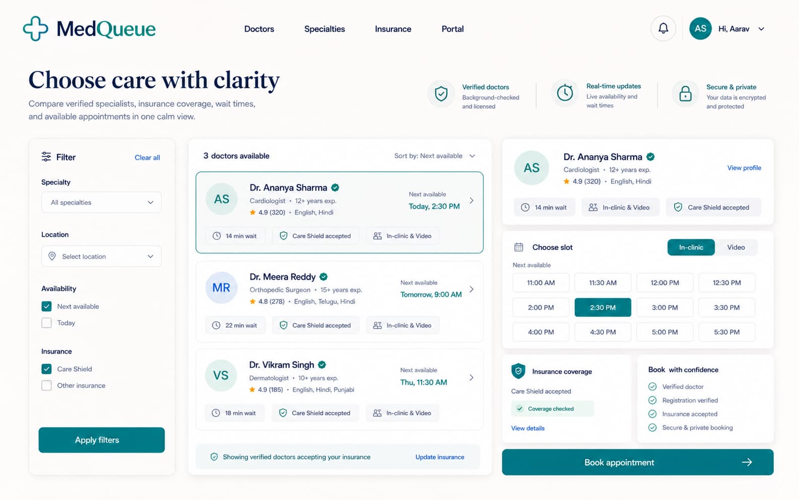
Star ratings are meaningless in healthcare. A 4.6 vs 4.7 tells a patient nothing. We replaced the star system with contextual success metrics: years of experience, patients consulted, specialization depth, and — where verifiable — procedure success rates. This required extensive data architecture work, but it gave patients something star ratings never could: a reason to believe.
The 3-tap booking flow
Every tap in a booking flow is a chance for the patient to second-guess their decision. We compressed the entire search-to-confirmation journey into three deliberate interactions: (1) Search + Filter → select doctor, (2) Choose slot from availability grid, (3) Confirm + pay. No account creation wall. No multi-page forms. No 'preferred time' dropdowns that get ignored. Each screen surfaces exactly what the patient needs to commit.
The availability grid: borrowed from airlines, rebuilt for clinics
Real-time availability is the entire value proposition. We designed a visual grid inspired by airline seat selection: time blocks as visual cells, color-coded by availability density, scrollable by day. Patients can scan an entire week of availability in 2 seconds — something no dropdown or calendar widget can achieve. The grid also surfaces wait-time estimates, turning an invisible anxiety into visible, manageable data.
Trust hierarchy: credentials before convenience
Most booking platforms lead with convenience: 'Book in 60 seconds!' We deliberately led with trust signals. The doctor profile page opens with verified credentials, medical registration number, hospital affiliations, and years of active practice — before showing the booking button. Our research showed that patients who trust first, book faster. Convenience is the outcome of confidence, not a substitute for it.
Why we killed the chat-with-doctor feature
Early wireframes included a pre-appointment chat feature. We cut it. Patient interviews revealed that chat created more anxiety than it resolved — patients would agonize over how to describe symptoms via text, worry about response times, and often use chat as a procrastination tool to avoid actually booking. The platform's job is to get patients into a consultation room, not to become one.
Results & Impact
Measurable outcomes from design decisions — not vanity metrics.
Tech Stack
Client Testimonial
We'd tried three different platforms before MedQueue. They all looked like databases with a coat of paint. Kivox understood that we weren't building a directory — we were building a decision engine. The booking numbers speak for themselves, but what I'm most proud of is that patients tell us they feel confident before they even walk into the clinic.
Who it serves
- Patients searching for specialists in metro cities
- First-time users unfamiliar with online doctor booking
- Repeat patients managing chronic care appointments
- Caregivers booking on behalf of family members
Primary actions
- Search for a doctor by specialty, symptom, or location
- View doctor credentials, reviews, and trust signals
- Book an appointment from real-time availability
- Manage upcoming and past appointments
Key sections
- Search & Discovery (filters, specialty taxonomy, location)
- Doctor Profiles (credentials, reviews, availability grid)
- Booking Flow (slot selection, payment, confirmation)
- Patient Dashboard (upcoming, history, prescriptions)
- Clinic Management (schedule, patient queue, analytics)
Next project